The chart has 5 main components:
•Trade Thermometer - This is the yellow line with blue/red/black between it. This shows us where trading occurred in that period if a NORMAL amount of trade occured. The yellow line sits between the bid and ask price and the color between the yellow line is set as follows:
oBlue - Indicates that we traded more buy market orders than sell market orders.
oRed - Indicates that we traded more sell market orders than sell market orders.
oBlack - Indicates that no trades occurred.
•Bids - Below the Trade Thermometer, we have the bids. Buy Limit Orders. These are in blue above. The darker colored area represents an area where the bids were low. The lighter area shows where the bids were higher. The shading from low to high is done automatically and there are 8 shades representing different levels of depth. In the image above, we see extremely high bids at 43.80 indicated by the white coloring. We see extremely low bids at 43.74 indicated by the dark (almost black) coloring.
•Offers - Above the Trade Thermometer, we have the offers/asks. Sell Limit Orders. These are in red above. The darker colored area represents an area where the offers were low. The lighter area shows where the offers were higher. The shading from low to high is done automatically and there are 8 shades representing different levels of depth.
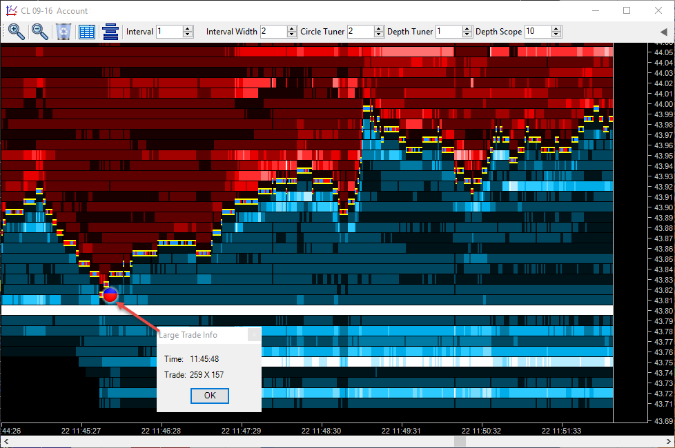
•Large Trade Circles - These circles appear when we have an exceptional amount of trade occur at a price over time. As long as we continue trading at a price, it will accumulate the amount traded and if this is considered to be exceptionally large (proprietary algorithms decide what is large, there are no settings for you to make), then a circle will appear. The color of the circle represents the balance of trade. Blue represents buy market orders and red represents sell market orders. In the above example, we can see we have more red, which means more sell market orders. In this case, we see sellers are active but getting trapped as price is no longer moving down. The size of the circles is relative. Larger circles mean more volume traded there and small circles mean less volume traded there.
•Large Trade Circle Information Box - If you click a circle, a box will appear telling you the time the last trade in the circle occurred as well as the balance of trade. In the above example, we see the last trade was at 11:45:48 and we had 259 sell market orders and 157 buy market orders.
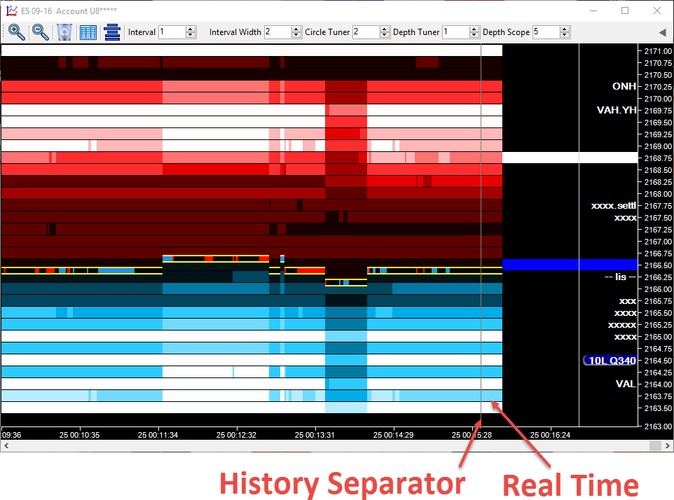
History Vs Real Time
The chart moves from left to right. There is a slim vertical bar (History Separator) that moves from left to right with the price:
 '
'
Everything to the left of the History Separator is historical information. To the right of the Separator is current information. The current bids/offers and trade levels.
Note that whilst most markets only supply 10 or 20 levels of depth, Auction Vista remembers what was bid/offered at each level beyond that and will display as historical information.